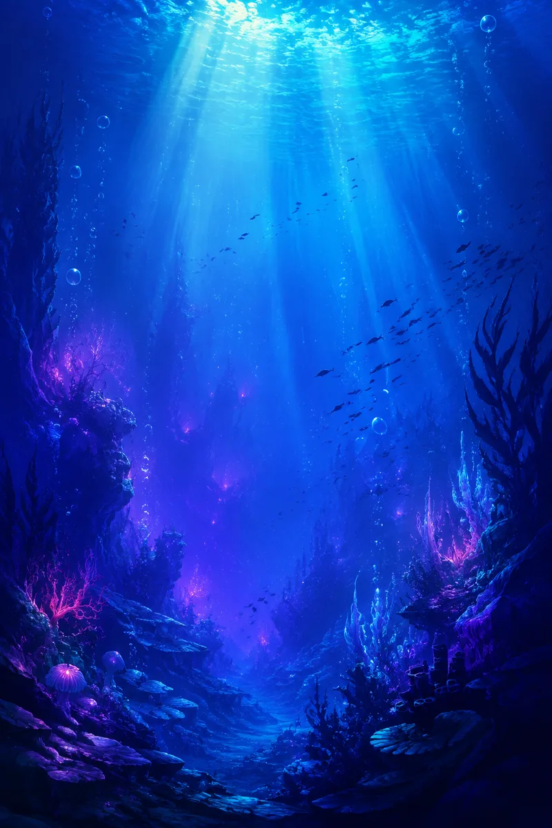
Blue, violet and magenta can suggest cold depth, refracted light and an electric accent. Their effect depends less on the number of hues than on which one occupies the background, which carries the structure and which appears only at the focal point.
Choose a dominant temperature
Begin with a deep blue field. It gives brighter cyan and magenta room to appear luminous without covering the whole image in maximum saturation. Violet can bridge warm and cool passages, especially where a foreground form fades into distance.
Write the palette as proportions: roughly a large dark field, a smaller structural blue-cyan range and a very small magenta accent. The exact percentages are artistic decisions, not a quality formula. The discipline is simply to prevent every color from asking for equal attention.
Separate hue from value
Two different hues can have nearly the same brightness. When that happens, their boundary disappears at small size even though it looks colorful when enlarged. Temporarily view the work in grayscale and adjust lightness before adding more saturation.
The central shafts in Violet Descent are brighter than the canyon walls. That value difference establishes depth. Magenta remains lower and more local, acting as an accent rather than a second competing light source.
Use saturation to tell distance
Distant water often benefits from lower contrast and softer edges in an invented scene. Nearby bubbles or fish edges can carry a cleaner cyan. This is a design convention for atmospheric depth, not a scientific reconstruction of underwater optics.
Avoid using neon color to identify a species or real habitat unless the reference supports it. In this collection the fish silhouettes and canyon are explicitly fantasy forms, so color describes mood and hierarchy rather than biological appearance.
Test against interface colors
Preview common white clock text and a grid of varied app icons over the artwork. If the top field is too bright, darken or simplify it rather than adding an artificial blur after export. Check a dim display as well as full brightness.
A wallpaper should still feel intentional when much of it is covered. Save a clean master without interface graphics, then create separate previews. This keeps the downloadable artwork honest and reusable across device layouts.
Working takeaway
Let blue carry the field, use violet for transition and reserve magenta for a small, purposeful accent.
File used in this guide
The example is one of three original 1024×1536 PNG artworks in this edition. The optimized WebP is used for page speed; the labelled PNG is available from the Wallpaper Gallery together with its current use conditions.
Open the wallpaper gallery