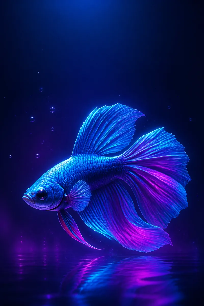
A vertical wallpaper is not simply a poster turned sideways. The screen places permanent interface elements over the image, crops differently across devices and is often viewed for only a second. A successful fish illustration treats those limits as part of the composition.
Start with the usable field
Mark the top clock zone, the lower shortcut area and a generous outer crop margin before drawing. These zones vary by operating system and device, so they are guides rather than universal templates. The important decision is to keep the most recognizable part of the fish away from likely overlays.
In Light Current, the fish sits below the upper third and turns into the brighter center. The dark water above it is purposeful negative space. A user can read the time without placing white numerals over the face or eye.
Make the silhouette survive at a glance
Reduce the sketch to one flat shape. The body, fins and tail should remain distinct at thumbnail size. Thin details can return later, but they cannot rescue a silhouette that merges into its background. A side or three-quarter view usually offers a clearer fish shape than a frontal view.
Edge lighting helps separate a dark body from dark water. Use it selectively around the head, dorsal edge and tail rather than tracing every contour with the same glow. Uneven emphasis gives the subject direction and avoids a sticker-like outline.
Compose for more than one crop
A 2:3 source can be trimmed into taller phone ratios. Keep the eye, head and main tail curve inside a central safe column, and extend water texture beyond it. Test both center crop and slight horizontal shifts because lock screens sometimes zoom or reposition an image.
Do not claim universal compatibility. Export one clearly labelled source file, state its pixel dimensions and let the reader preview it on the intended device. A crop that works on one model can place the fish too close to the edge on another.
Finish detail in layers
Keep the focal detail around the eye and leading scales. Let texture simplify toward the tail and distant water so the subject does not compete with every bubble. A controlled detail gradient also reduces visual noise behind icons.
Check the final image in grayscale and at actual phone size. Grayscale reveals whether value contrast carries the silhouette; device scale reveals whether the fine strokes remain useful. Both checks are more informative than zooming into the full-resolution canvas.
Working takeaway
Reserve interface space first, secure a readable silhouette and test the real crop before polishing detail.
File used in this guide
The example is one of three original 1024×1536 PNG artworks in this edition. The optimized WebP is used for page speed; the labelled PNG is available from the Wallpaper Gallery together with its current use conditions.
Open the wallpaper gallery